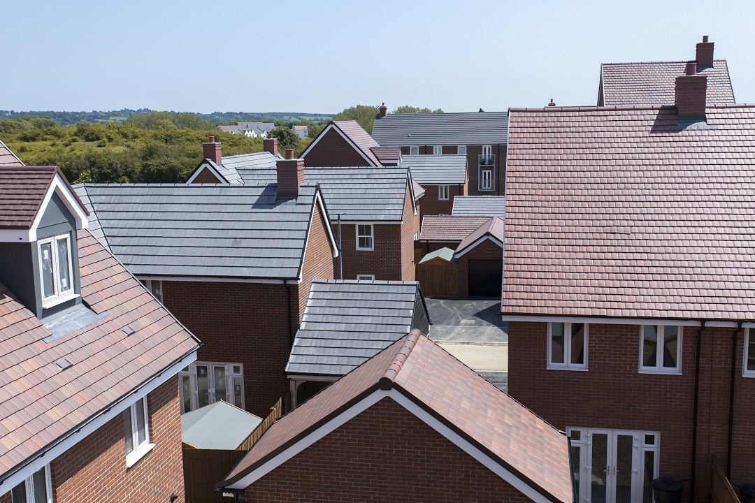
On-trend shades: colours of the year 2020

19 December 2019

a photo of some paint colour charts

Those seeking to redecorate in 2020 should take inspiration from the natural world, according to experts from the paint industry. Gone are 2019’s earthy hues; the colours of the year for 2020 are dominated by blues and greens, ranging from delicate to rich. Whether you’ve lived there for some time or have just moved into your new home, read on for inspiration on how to bring your walls up to date!

Pantone – Classic Blue (19-4052)

A ‘reassuring presence instilling calm, confidence and connection’, this cobalt shade is Pantone’s first multi-sensory colour of the year. The company has collaborated with a number of ‘sensory experts’ from the music, food, fashion, beauty and technology industries to interpret PANTONE 19-4052 Classic Blue as a sound, a smell, and a taste. Leatrice Eiseman, executive director of the Pantone Color Institute, says that the hue ‘provides an anchoring foundation’ while also encouraging us ‘to look beyond the obvious to expand our thinking’.

Dulux – Tranquil Dawn

Tranquil Dawn is inspired by the morning sky, symbolising the fact that 2020 will be a new decade and can offer a fresh start. This pale green, described by creative director Marianne Shillingford as ‘that colour that lies between the land and the sky on a misty morning’, is a soft and muted shade which works particularly well with warm, neutral and bright palettes.

Benjamin Moore – First Light 2102-70

This soft pink reflects ‘the air of positivity’ as we enter a new decade and offers a refreshing alternative to other neutral shades. According to Helen Shaw, director of Benjamin Moore UK, the tone ‘flatters any space and reflects the desire to use blush tones in grown-up spaces and a desire to introduce more colour overall into our environment.’

Sherwin-Williams – Naval SW 6244

Announced as ‘the new, approachable neutral that goes with everything’, Sherwin-Williams’ colour of 2020 is a deep blue which is reminiscent of the deep sea and the night sky, while also giving a nod to Art Deco. The company says the colour ‘creates a calm and grounding environment infused with quiet confidence’, and pairs well with natural finishes and coastal-inspired decor.

Behr – Back to nature (S340-4)

Behr’s colour of 2020 is ‘all about encouraging people to engage with the Great Outdoors,’ according to Erika Woelfel, the company’s VP of color and creative services, who describes Back to nature as a ‘restorative, subtle, effortless, meadow-inspired hue’. Both vibrant and calm, the colour is subtle enough to act as a neutral shade.

PPG Paints – Chinese Porcelain (PPG1160-6)


In today’s fast-paced world, PPG Paints’ deep, inky blue ‘imparts calmness and restful sleep while also offering the spirit of hopefulness’. According to the company’s senior colour manager Dee Schlotter, consumers crave shades which bring them ‘closer to natural elements such as the sea and sky’.

Graham & Brown – Adeline

The given name of Virginia Woolf, Adeline is a rich bottle-green which makes a dramatic statement while encapsulating the serenity of nature. This fresh tone, drawn from the same palette as the company’s wallpaper of the year, works particularly well with metallic accents.